Pandas Series: plot.bar() function
Series-plot.bar() function
The plot.bar() function is used to create a vertical bar plot.
A bar plot is a plot that presents categorical data with rectangular bars with lengths proportional to the values that they represent. A bar plot shows comparisons among discrete categories. One axis of the plot shows the specific categories being compared, and the other axis represents a measured value.
Syntax:
Series.plot.bar(self, x=None, y=None, **kwargs)
Parameters:
| Name | Description | Type/Default Value | Required / Optional |
|---|---|---|---|
| x | Allows plotting of one column versus another. If not specified, the index of the DataFrame is used. | label or position | Optional |
| y | Allows plotting of one column versus another. If not specified, all numerical columns are used. | label or position | Optional |
| **kwds | Additional keyword arguments are documented in DataFrame.plot(). | Optional |
Returns: matplotlib.axes.Axes or np.ndarray of them An ndarray is returned with one matplotlib.axes.Axes per column when subplots=True.
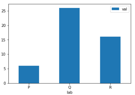
Example - Basic plot:
Python-Pandas Code:
import numpy as np
import pandas as pd
df = pd.DataFrame({'lab':['P', 'Q', 'R'], 'val':[6, 26, 16]})
ax = df.plot.bar(x='lab', y='val', rot=0)
Output:
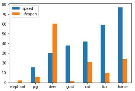
Example - Plot a whole dataframe to a bar plot. Each column is assigned a distinct color, and each row is nested in a group along the horizontal axis:
Python-Pandas Code:
import numpy as np
import pandas as pd
speed = [0.1, 15.5, 30, 38, 42, 59, 77]
lifespan = [2, 6, 60, 1.5, 21, 10, 24]
index = ['elephant', 'pig', 'deer',
         'goat', 'cat', 'fox', 'horse']
df = pd.DataFrame({'speed': speed,
                   'lifespan': lifespan}, index=index)
ax = df.plot.bar(rot=0)
Output:
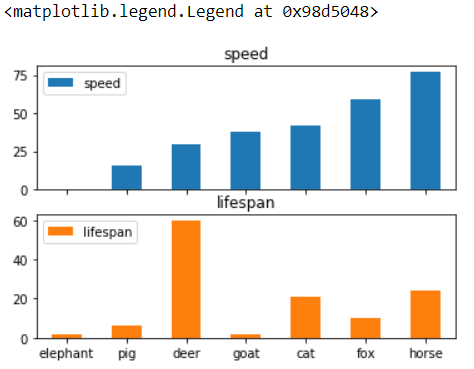
Example - Instead of nesting, the figure can be split by column with subplots=True. In this case, a numpy.ndarray of matplotlib.axes.Axes are returned:
Python-Pandas Code:
import numpy as np
import pandas as pd
speed = [0.1, 15.5, 30, 38, 42, 59, 77]
lifespan = [2, 6, 60, 1.5, 21, 10, 24]
index = ['elephant', 'pig', 'deer',
         'goat', 'cat', 'fox', 'horse']
df = pd.DataFrame({'speed': speed,
                   'lifespan': lifespan}, index=index)
axes = df.plot.bar(rot=0, subplots=True)
axes[1].legend(loc=2)  # doctest: +SKIP
Output:
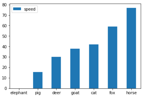
Example - Plot a single column:
Python-Pandas Code:
import numpy as np
import pandas as pd
speed = [0.1, 15.5, 30, 38, 42, 59, 77]
lifespan = [2, 6, 60, 1.5, 21, 10, 24]
index = ['elephant', 'pig', 'deer',
         'goat', 'cat', 'fox', 'horse']
df = pd.DataFrame({'speed': speed,
                   'lifespan': lifespan}, index=index)
ax = df.plot.bar(y='speed', rot=0)
Output:
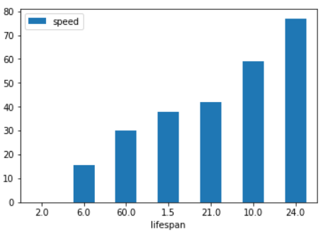
Example - Plot only selected categories for the DataFrame:
Python-Pandas Code:
import numpy as np
import pandas as pd
speed = [0.1, 15.5, 30, 38, 42, 59, 77]
lifespan = [2, 6, 60, 1.5, 21, 10, 24]
index = ['elephant', 'pig', 'deer',
         'goat', 'cat', 'fox', 'horse']
df = pd.DataFrame({'speed': speed,
                   'lifespan': lifespan}, index=index)
ax = df.plot.bar(x='lifespan', rot=0)
Output:
PREV : Series-plot.area() function
NEXT : Series-plot.barh() function