Pandas: Create a stacked histograms plot of different columns
8. Stacked Histograms of Stock Prices
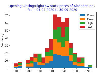
Write a Pandas program to create a stacked histograms plot of opening, closing, high, low stock prices of Alphabet Inc. between two specific dates.
Use the alphabet_stock_data.csv file to extract data.
alphabet_stock_data:
alphabet_stock_data Table
| Date | Open | High | Low | Close | Adj Close | Volume |
|---|---|---|---|---|---|---|
| 2020-04-01 | 1122 | 1129.689941 | 1097.449951 | 1105.619995 | 1105.619995 | 2343100 |
| 2020-04-02 | 1098.26001 | 1126.859985 | 1096.400024 | 1120.839966 | 1120.839966 | 1964900 |
| 2020-04-03 | 1119.015015 | 1123.540039 | 1079.810059 | 1097.880005 | 1097.880005 | 2313400 |
| 2020-04-06 | 1138 | 1194.660034 | 1130.939941 | 1186.920044 | 1186.920044 | 2664700 |
| ... | ... | ... | ... | ... | ... | ... |
| ... | ... | ... | ... | ... | ... | ... |
| 2020-09-29 | 1470.390015 | 1476.662964 | 1458.805054 | 1469.329956 | 1469.329956 | 978200 |
| 2020-09-30 | 1466.800049 | 1489.75 | 1459.880005 | 1469.599976 | 1469.599976 | 1700600 |
Sample Solution:
Python Code :
import pandas as pd
import matplotlib.pyplot as plt
df = pd.read_csv("alphabet_stock_data.csv")
start_date = pd.to_datetime('2020-4-1')
end_date = pd.to_datetime('2020-9-30')
df['Date'] = pd.to_datetime(df['Date'])
new_df = (df['Date']>= start_date) & (df['Date']<= end_date)
df1 = df.loc[new_df]
df2 = df1[['Open','Close','High','Low']]
plt.figure(figsize=(25,25))
df2.plot.hist(stacked=True, bins=20)
plt.suptitle('Opening/Closing/High/Low stock prices of Alphabet Inc.,\n From 01-04-2020 to 30-09-2020', fontsize=12, color='blue')
plt.show()
Sample Output:
Click for download alphabet_stock_data.csv
For more Practice: Solve these Related Problems:
- Write a Pandas program to create a stacked histogram that combines opening, closing, high, and low prices into one plot.
- Write a Pandas program to generate a stacked histogram for the four price columns using different color shades for each.
- Write a Pandas program to build a stacked histogram that displays the relative frequency of each price type on a single axis.
- Write a Pandas program to produce a pivot table of price data and plot it as a stacked histogram to compare distributions.
Go to:
PREV : Histograms of Stock Prices.
NEXT : Horizontal and Cumulative Histogram of Opening Prices.
Python Code Editor:
Have another way to solve this solution? Contribute your code (and comments) through Disqus.
What is the difficulty level of this exercise?
Test your Programming skills with w3resource's quiz.