Pandas - Creating a Pair Plot using Seaborn for Multiple variable analysis
6. Pair Plot with Seaborn
Write a Pandas program to create a Pair Plot with Seaborn.
This exercise demonstrates how to create a pair plot using Seaborn to visualize relationships between all numerical columns in a DataFrame.
Sample Solution :
Code :
import pandas as pd
import seaborn as sns
import matplotlib.pyplot as plt

# Create a sample DataFrame
df = pd.DataFrame({
    'Height': [150, 160, 170, 180, 190],
    'Weight': [50, 60, 70, 80, 90],
    'Age': [22, 25, 30, 35, 40]
})

# Create a pair plot to visualize relationships between columns
sns.pairplot(df)

# Display the plot
plt.show()
Output:
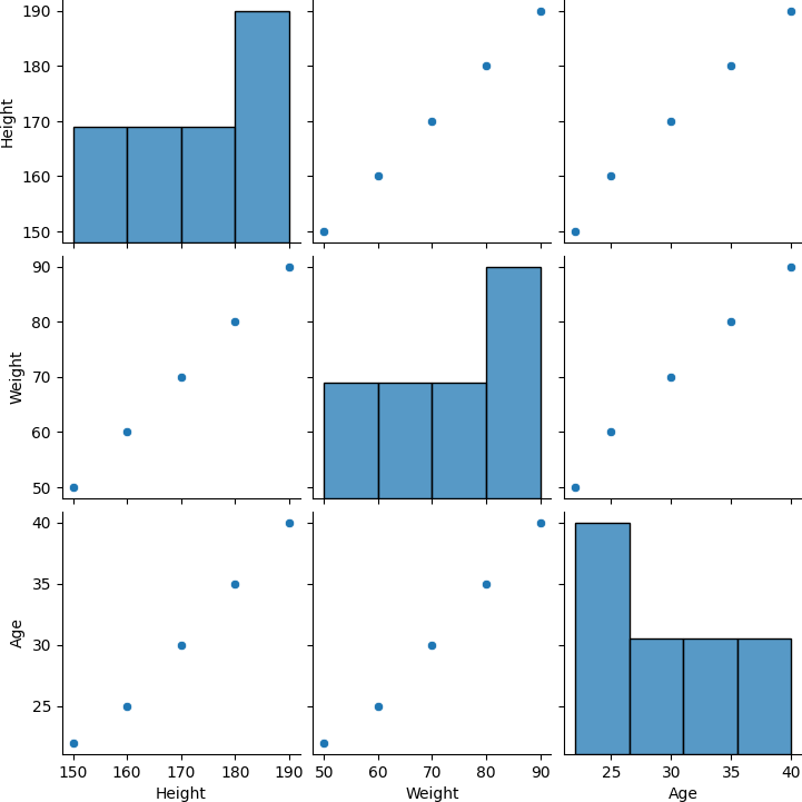
Explanation:
- Created a DataFrame with numerical columns.
- Used sns.pairplot() to generate scatter plots for every pair of numerical columns, visualizing the relationships.
- Displayed the resulting pair plot.
For more Practice: Solve these Related Problems:
- Write a Pandas program to create a pair plot for a DataFrame containing both numerical and categorical variables.
- Write a Pandas program to generate a pair plot with customized markers and diagonal histograms for each variable.
- Write a Pandas program to produce a pair plot that includes regression lines on the off-diagonal scatter plots.
- Write a Pandas program to create a pair plot and filter out specific variable combinations based on their correlation coefficients.
Go to:
PREV : Box Plot with Pandas and Seaborn.
NEXT : Heatmap Visualization with Seaborn.
Python-Pandas Code Editor:
Have another way to solve this solution? Contribute your code (and comments) through Disqus.
What is the difficulty level of this exercise?
Test your Programming skills with w3resource's quiz.