Creating a Histogram Plot with Pandas and Matplotlib
4. Histogram Plot with Pandas and Matplotlib
Write a Pandas program to create a Histogram Plot with Pandas and Matplotlib.
This exercise demonstrates how to create a histogram to show the distribution of numerical data using Pandas and Matplotlib.
Sample Solution :
Code :
import pandas as pd
import matplotlib.pyplot as plt

# Create a sample DataFrame
df = pd.DataFrame({
    'Ages': [22, 25, 29, 30, 35, 40, 45, 22, 25, 33]
})

# Create a histogram to show the distribution of ages
df['Ages'].plot(kind='hist', bins=5)

# Add a title
plt.title('Age Distribution')

# Display the plot
plt.show()
Output:
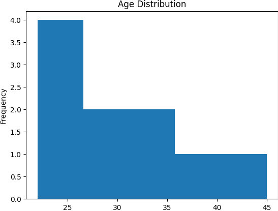
Explanation:
- Created a DataFrame with 'Ages' data.
- Used the plot() function with kind='hist' to create a histogram for the age distribution.
- Set the number of bins to 5 and displayed the plot.
For more Practice: Solve these Related Problems:
- Write a Pandas program to create a histogram with custom bin sizes and annotate the bin with the highest frequency.
- Write a Pandas program to generate overlapping histograms for two columns with transparency adjustments to compare distributions.
- Write a Pandas program to create a histogram for a DataFrame column and overlay a kernel density estimate (KDE) plot.
- Write a Pandas program to create a cumulative histogram and compare it with the original frequency distribution.
Go to:
PREV : Scatter Plot with Seaborn and Pandas.
NEXT : Box Plot with Pandas and Seaborn.
Python-Pandas Code Editor:
Have another way to solve this solution? Contribute your code (and comments) through Disqus.
What is the difficulty level of this exercise?
Test your Programming skills with w3resource's quiz.