Creating a Bar Plot with Pandas and Matplotlib
3. Scatter Plot with Seaborn and Pandas
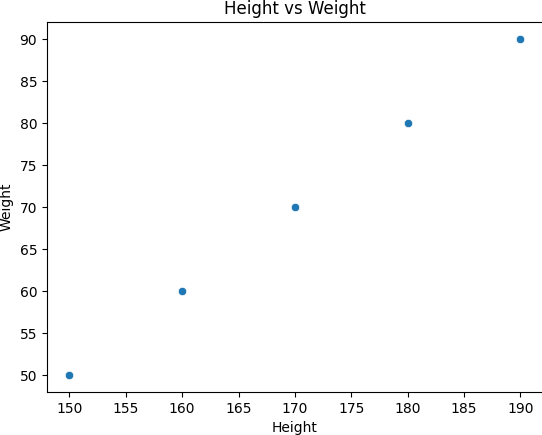
Write a Pandas program that scatters Plot with Seaborn and Pandas.
This exercise shows how to create a scatter plot using Pandas and Seaborn to visualize relationships between two variables.
Sample Solution :
Code :
import pandas as pd
import seaborn as sns
import matplotlib.pyplot as plt

# Create a sample DataFrame
df = pd.DataFrame({
    'Height': [150, 160, 170, 180, 190],
    'Weight': [50, 60, 70, 80, 90]
})

# Create a scatter plot of 'Height' vs 'Weight'
sns.scatterplot(x='Height', y='Weight', data=df)

# Add a title
plt.title('Height vs Weight')

# Display the plot
plt.show()
Output:
Explanation:
- Created a DataFrame with 'Height' and 'Weight' columns.
- Used sns.scatterplot() to plot 'Height' vs 'Weight' as a scatter plot.
- Added a title and displayed the plot using plt.show().
For more Practice: Solve these Related Problems:
- Write a Pandas program to create a scatter plot using Seaborn with the hue parameter set to a categorical column.
- Write a Pandas program to plot a scatter graph that includes a regression line and displays the confidence interval.
- Write a Pandas program to generate a scatter plot where marker size is proportional to a third variable from the DataFrame.
- Write a Pandas program to create a scatter plot with jitter added to handle overlapping points in a dense dataset.
Go to:
PREV : Bar Plot with Pandas and Matplotlib.
NEXT : Histogram Plot with Pandas and Matplotlib.
Python-Pandas Code Editor:
Have another way to solve this solution? Contribute your code (and comments) through Disqus.
What is the difficulty level of this exercise?
Test your Programming skills with w3resource's quiz.