Creating a Pie Chart with Pandas and Matplotlib
8. Pie Chart using Pandas and Matplotlib
Write a Pandas program to create a pie chart using Pandas and Matplotlib.
This exercise shows how to create a pie chart using Pandas and Matplotlib to visualize the proportions of categorical data.
Sample Solution :
Code :
import pandas as pd
import matplotlib.pyplot as plt
# Create a sample DataFrame
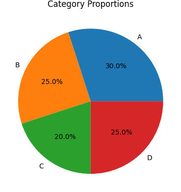
df = pd.DataFrame({
'Category': ['A', 'B', 'C', 'D'],
'Values': [30, 25, 20, 25]
})
# Create a pie chart for 'Values' by 'Category'
plt.pie(df['Values'], labels=df['Category'], autopct='%1.1f%%')
# Add a title
plt.title('Category Proportions')
# Display the plot
plt.show()
Output:
Explanation:
- Created a DataFrame with categories and their values.
- Used plt.pie() to create a pie chart that shows the proportions of each category.
- Added labels and percentage annotations (autopct='%1.1f%%') to the chart.
- Displayed the pie chart with a title.
For more Practice: Solve these Related Problems:
- Write a Pandas program to create a pie chart representing the proportion of different categories in a DataFrame.
- Write a Pandas program to generate a pie chart with exploded slices for the top three categories.
- Write a Pandas program to create a pie chart with custom colors and a legend that maps each slice to its category.
- Write a Pandas program to generate a donut chart by modifying a standard pie chart and adding a central hole.
Go to:
PREV : Heatmap Visualization with Seaborn.
NEXT : Multiple Line Plots in One Figure with Pandas.
Python-Pandas Code Editor:
Have another way to solve this solution? Contribute your code (and comments) through Disqus.
What is the difficulty level of this exercise?
Test your Programming skills with w3resource's quiz.